Format LinkedIn Posts for Better Engagement
Learn to format LinkedIn posts that stop the scroll. Discover proven tactics for hooks, whitespace, emojis, and carousels that drive real engagement.

To get your LinkedIn posts seen, you have to nail the formatting. That means creating a scannable structure with a strong hook, keeping your paragraphs short, and ending with a clear call to action. Making smart use of whitespace, bullets, and even emojis can make all the difference, especially since most people are scrolling on their phones.
Why Your LinkedIn Formatting Matters
Let's be honest—your feed is crowded. In that sea of content, formatting isn't just about making things look pretty; it's about being heard. I've seen countless brilliant ideas get completely ignored simply because they were presented as a dense, unreadable block of text. Your insights deserve to be seen, and ethical formatting respects your audience's time.

This isn't about getting fancy. It’s about clear, respectful communication. The goal is to make your content feel inviting and easy to digest. Think about how you use social media. Do you ever stop for a massive wall of text on your phone? Probably not.
The Psychology of the Mobile Scroll
You have to understand how people read online. Well-formatted LinkedIn posts can pull in 300% more engagement than plain text. That single stat should change how you think about writing for the platform. It's even more critical when you realize 70% of LinkedIn usage is on mobile, where big paragraphs look like an intimidating wall of text that people instinctively skip.
This mobile-first world makes whitespace your best friend. Short sentences and one-line paragraphs create visual breaks, giving the reader's eyes a place to rest. It just makes the content feel less like a chore to read.
"Formatting is the visual handshake of your content. A clean, well-structured post invites people in and signals that you respect their time and attention."
Breaking up your text is a simple act that shows professionalism and a real commitment to providing value. It's a small bit of effort that pays off big time in visibility and engagement. For more tips on building your online presence, you can check out our other articles on the Contentide blog.
The Three Pillars of a High-Performing Post
Every great LinkedIn post, no matter the topic, is built on three fundamental elements. If you can get these right, you’ll have a reliable foundation for everything you share.
- The Compelling Hook: Your first 1-3 lines are everything. This is your one shot to grab attention with a bold statement, a relatable problem, or a question that makes people think.
- The Readable Body: This is where you deliver the goods. Use short paragraphs, bullet points, and numbered lists to break down your main points and make them easy to scan.
- The Effective Call to Action (CTA): Always end with a clear, simple instruction. Ask a question to start a conversation, tell people what to do next, or invite them to share their own take.
And remember, even before someone reads a single word, they see your profile picture. It’s a crucial part of the first impression. Learning what makes a good LinkedIn profile picture is a key piece of the "formatting" puzzle that truly matters.
LinkedIn Formatting Elements at a Glance
To make it even simpler, here's a quick rundown of the core formatting elements and why they work. Each one plays a specific role in turning a scroller into a reader.
| Formatting Element | Primary Purpose | Impact on Engagement |
|---|---|---|
| Strong Hook | Grabs immediate attention in the feed. | Increases click-throughs to read the full post. |
| Whitespace | Improves readability, especially on mobile. | Reduces bounce rate and encourages completion. |
| Short Paragraphs | Makes content feel less overwhelming. | Boosts readability and time spent on the post. |
| Bullet Points | Highlights key information for skimmers. | Makes complex ideas digestible and memorable. |
| Emojis | Adds personality and visual cues. | Can increase likes and comments by adding emotion. |
| Clear CTA | Guides the reader on what to do next. | Directly drives comments, shares, and other actions. |
Think of these elements as your toolkit. You don't need to use every single one in every post, but knowing how and when to deploy them will dramatically improve your results. It's the difference between being ignored and being heard.
Crafting a Hook That Stops the Scroll
On LinkedIn, you have about three lines. That's it. Before a reader has to click "...see more," those first few sentences carry all the weight. Their only job? To ethically slam the brakes on the endless scroll and earn you a few seconds of attention.
If your hook fails, the rest of your brilliant content might as well be invisible.
A great hook isn't just a clever line—it's a promise you make to the reader. It sets the expectation that what follows is going to be valuable, insightful, or at the very least, interesting. Nailing this is the first real step to properly format LinkedIn posts for high engagement.
What Makes a Hook Work
The best hooks tap into basic human psychology. They spark curiosity, challenge a belief everyone takes for granted, or create an instant connection over a shared struggle. It’s time to ditch generic openings like "I'm excited to announce..." and focus on creating genuine intrigue.
There are a few formulas I see work time and time again. Each serves a different purpose, but they all share one goal: make the reader stop and think.
- The Contrarian Statement: Take a widely held belief in your industry and flip it on its head. Something like, "Everyone thinks you need more leads. They're wrong. You need fewer, better ones." This creates immediate tension and makes people lean in to hear your reasoning.
- The Relatable Story: Drop the reader right into the middle of a personal story. A hook like, "My biggest client fired me over a $50 invoice. It was the best thing that ever happened to my business," is infinitely more compelling than a dry business lesson.
- The Thought-Provoking Question: Ask something your target audience has probably wondered about themselves. For instance, "What's the one skill that will be indispensable in marketing five years from now?"
If you're ever just staring at a blank page, a good tool can be a lifesaver for sparking ideas. You can get some instant inspiration with a quality hook generator built for professional content.
Your hook is the headline of your post. If it doesn’t create an "information gap"—a powerful urge to know more—you’ve already lost the battle for attention.
Structuring the Body for Effortless Reading
Okay, so your hook did its job. Now the body of your post has to deliver on that initial promise, and it has to do it in a way that’s dead simple to consume. This is where the visual side of how you format LinkedIn posts becomes absolutely critical.
Your mission is to guide the reader's eye down the page, not hit them with a wall of text.
The most powerful formatting tool you have? Whitespace.
Using whitespace generously gives your words room to breathe and makes your content feel approachable, especially on a tiny phone screen. The trick is to keep your paragraphs incredibly short—one to two sentences is the sweet spot. A single-sentence paragraph can even act as a powerful pause, adding emphasis where you need it most.
Transforming Text with Simple Formatting
Let's look at a real-world example. Say you want to share an insight about project management.
Before Formatting:
"Our recent project analysis revealed that the primary cause of delays isn't poor planning but a lack of psychological safety within the team. When team members are afraid to report small setbacks, those minor issues snowball into major roadblocks that derail the entire timeline. This is why fostering an environment of open communication where bad news can travel fast is more critical than any project management software or methodology. We found that teams with high psychological safety were 35% more likely to finish projects on time."
The insight is solid, but reading it feels like a chore. It’s dense and impossible to scan.
After Formatting:
"The #1 reason projects fail isn't what you think.
It’s not bad planning.
It’s not a lack of resources.
It’s a lack of psychological safety.
When people are afraid to report small problems, they become huge ones.
This is why creating a culture of open communication is more important than any software.
Our data shows teams with high psychological safety are 35% more likely to deliver on time.
Think about that."
See the difference? The second version is instantly more readable and hits harder. It uses one-line paragraphs, simple words, and strategic spacing to turn a block of text into a scannable story. This simple transformation is the core of effective LinkedIn content.
Using Emojis and Hashtags Authentically
Alright, you’ve nailed the structure and made your post easy to read. Now it's time for the finishing touches—the little visual cues that make your content feel alive. Emojis and hashtags, when you use them right, are serious assets. They inject personality, add context, and help more people find your post.
The secret is to be authentic. Don't just tack them on; make them an intentional part of your message. Think of emojis as your post’s body language. They can bring a little warmth, signal a joke, or draw the reader’s eye to a key point without you having to spell it out. This is a huge part of how you format LinkedIn posts to sound less like a corporate memo and more like a real person.
Using Emojis as Strategic Signposts
The goal here is to enhance your message, not drown it out. One of the most common mistakes I see is people littering their posts with emojis. It can come across as unprofessional and, honestly, just makes things harder to read.
Instead, think of them as functional signposts.
A well-placed emoji can do a few things really well. You can swap out boring old bullet points for something more visually interesting—a checklist ✅ or a lightbulb 💡 often breaks up the text far better than a simple dot.
Here are a few practical ways to use them without going overboard:
- Set the Tone: A single emoji in your hook—like a brain 🧠 for a deep thought or a chart 📊 for a data-backed insight—instantly tells people what your post is about.
- Guide the Reader: Use simple arrows (➡️, 👇) to point people toward your main takeaway or your call to action. It’s a tiny visual cue that makes a big difference in directing attention.
- Add Emphasis: Did you hit a milestone? Celebrate it with a trophy 🏆 or a rocket 🚀. Emojis add an emotional layer that plain text just can’t replicate, making your wins feel more tangible.
The golden rule? Less is more. I usually aim for no more than 3-5 emojis in a single post. This keeps the spotlight on your ideas while still giving the text a visual boost. The right emoji clarifies your point, it doesn't cloud it.
Demystifying Your Hashtag Strategy
Hashtags aren't just an afterthought you slap at the bottom of your post. They are a core discovery tool. They're how you connect your content with people who are actively searching for what you're talking about. Getting your hashtag strategy right is essential for formatting a LinkedIn post that actually gets seen.
Forget stuffing your post with a dozen generic tags like #business or #success. The algorithm—and your readers—can spot that a mile away. A small, carefully chosen set of hashtags is way more effective.
Finding the Right Mix of Hashtags
You're looking for a mix of tags that balances broad reach with niche relevance. A solid rule of thumb is to stick to between 3 and 5 hashtags per post. This focused approach gives LinkedIn's algorithm a crystal-clear signal about your content's topic, instead of diluting its focus.
Here’s a simple framework I use for picking hashtags:
- Broad Industry Tag (1): This is your high-volume tag related to your overall field. Think
#marketing,#projectmanagement, or#softwaredevelopment. This one helps get your content in front of a massive audience. - Niche Topic Tags (2-3): Get more specific here. If you're writing about email marketing, you might use
#emailstrategyor#contentmarketingtips. These tags connect you with a more targeted, engaged group of people who are genuinely interested. - Branded or Community Tag (1, optional): This could be a unique hashtag for your company (like
#ContentideTips) or one for a community you're active in. It's great for building brand identity and connecting with a specific tribe.
For instance, if I wrote a post about crafting better sales pitches, my hashtags might be: #sales (broad), #salestips (niche), #b2bsales (niche), and #closethedeal (niche). This combination ensures I’m reaching a wide but still highly relevant audience. By choosing your tags this thoughtfully, you turn them from simple labels into powerful distribution channels for your best ideas.
Creating High-Engagement Carousel Posts
If you're ready to share deeper knowledge and really grab your audience's attention, it's time to graduate from standard text posts. Let's talk about LinkedIn carousels—what the platform officially calls "document posts."
These multi-slide presentations are consistently one of the highest-performing formats on LinkedIn, and for good reason. They turn a simple post into an interactive experience, inviting your audience to swipe through your ideas one slide at a time.
The data backs this up, big time. Document posts achieve a whopping 278% more engagement than videos and an incredible 596% more engagement than plain text posts. This format is a beast for sharing guides, step-by-step frameworks, and educational content that's just too deep for a simple text update.
The best part? You don't need to be a graphic designer or pay for expensive software. A simple, often free, tool like Canva, Google Slides, or even PowerPoint is all you need. The real magic isn't in fancy design; it's in the value you pack into each slide and how you structure the story.
The Anatomy of a Winning Carousel
A great carousel tells a story. Each slide builds on the last, guiding the reader from a compelling hook to a satisfying conclusion. Think of it less like a corporate presentation and more like a bite-sized, visual article.
Every successful carousel I've seen shares a similar structure. Once you master this flow, you can make your content both valuable and addictive to swipe through.
Here’s the basic blueprint:
- Slide 1 The Title Slide: This is your hook. It needs a bold title, your name, and your headshot. Its only job is to make someone stop scrolling and get curious enough to swipe.
- Slides 2-3 The Problem/Context: Set the stage. What’s the common pain point or question you're tackling? Make it relatable so the reader immediately thinks, "Yep, that's me."
- Slides 4-9 The Solution/Value: This is the meat of your carousel. Break down your tips or insights into one main idea per slide. Use a mix of text, bullet points, and simple graphics to keep it scannable and easy to digest.
- Slide 10 The Call to Action (CTA): Never leave your reader hanging. Ask a question, invite them to follow you, or point them to a resource. Give them a clear next step.
This simple, repeatable structure provides a clear path for your audience, making complex information feel effortless to consume. It’s a core principle when you format LinkedIn posts for maximum impact.
Turning Ideas into Engaging Slides
Let's walk through a real-world scenario. Imagine you want to share "5 Common Mistakes New Freelancers Make." A text post might get lost in the feed, but a carousel turns it into a valuable, shareable resource that people will save.
First, you'd nail your title slide: "Stop Making These 5 Freelancing Mistakes." It's bold, direct, and promises a clear solution.
The next slide could set the scene by saying something like, "Starting a freelance business is tough. Most people stumble over the same hidden obstacles." This builds empathy and pulls the reader in.
Then, you dedicate one slide to each mistake. For example:
- Slide 4: Mistake #1 - Not Niching Down (with a short explanation)
- Slide 5: Mistake #2 - Underpricing Your Services (with a quick tip)
- And so on...
Your final slide is the CTA. It could be a simple question like, "What was the biggest mistake you made when starting out? Share in the comments!" This sparks immediate engagement and turns passive readers into active participants.
The most effective carousels focus on one single, powerful idea per slide. Resisting the urge to cram too much information onto a single slide is what separates a clear, compelling carousel from a cluttered, confusing one.
To get a head start on creating visually appealing carousels, using pre-designed LinkedIn carousel templates can be a huge time-saver. Many are affordable and provide a professional starting point, letting you focus on the quality of your content.
Visuals like emojis and hashtags, followed by compelling imagery, can further elevate your post's performance and stopping power.
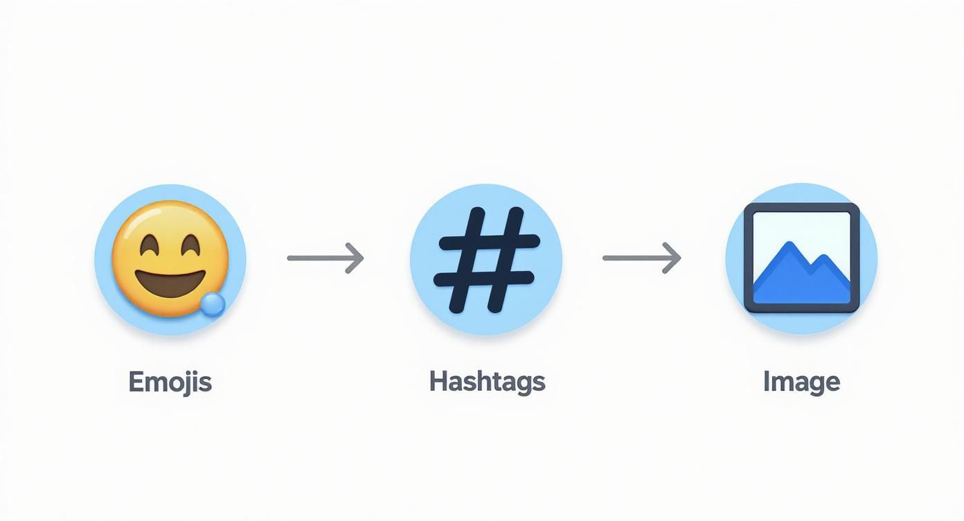
This flow shows how layering these simple visual elements can systematically make your content more eye-catching.
Choosing Between a Text Post and a Carousel
So, when should you go all-in on a carousel versus sticking with a well-formatted text post? It really comes down to the depth and structure of your idea. A carousel is an investment in time, so you want to make sure the topic justifies the effort.
Here's a quick comparison to help you decide.
| Consideration | Best for Text Posts | Best for Carousel Posts |
|---|---|---|
| Content Depth | Single idea, quick tip, personal story, or a hot take. | Multi-step process, listicle, detailed guide, or data story. |
| Audience Goal | Sparking quick conversation and comments. | Educating, building authority, and creating a saveable resource. |
| Creation Time | Quick to write and format (5-15 minutes). | More time-intensive (30-60+ minutes for design and content). |
| Ideal Structure | A strong hook followed by scannable body text. | A narrative flow with a clear beginning, middle, and end. |
| Engagement Type | Likes, comments, and shares. | Swipes, saves, comments, and high dwell time. |
Ultimately, both formats have their place in a strong content strategy. Use text posts for your daily insights and quick wins, and save carousels for your cornerstone ideas—the ones you really want to be known for.
Writing a Call to Action That People Answer
A brilliant post with a weak ending is a huge missed opportunity. You've worked hard to stop the scroll and deliver real value—now you need to give that momentum a purpose. Your call to action (CTA) is that final, crucial bridge between your content and genuine community engagement.
The goal isn't always a hard sell; in fact, on LinkedIn, it rarely should be. It’s about starting a conversation, building a community, and guiding your reader toward a simple, logical next step. Ditching manipulative phrases is the first step toward writing a CTA that people actually want to answer.
Sparking Conversation with Questions
The easiest and often most effective way to get people talking is to just ask a question. A good open-ended question invites your audience to share their own experiences and perspectives, instantly turning your monologue into a dialogue.
But not all questions work. A vague "What do you think?" is lazy and usually gets ignored. You have to be specific and make it dead simple for people to answer.
- Ask for a specific experience: "What's the best piece of career advice you've ever received? 👇"
- Present a simple choice: "Are you Team A or Team B on this? Let me know."
- Request a single recommendation: "What's one book that completely changed your perspective on leadership?"
These kinds of questions lower the barrier to entry, making it far more likely someone will take a moment to type out a response. This is a fundamental technique when you format LinkedIn posts for real interaction.
Guiding Action with Clear Directives
Sometimes, your goal isn’t just a chat—it's to get someone to do something specific. In those cases, your CTA needs to be crystal clear. Ambiguity is the enemy of action.
Tell your audience exactly what you want them to do and, if you can, why it benefits them. This is all about providing confident, straightforward direction.
For instance, instead of a passive "Check out my new article," try something more compelling that immediately highlights the value you’re offering.
Your CTA should be the most straightforward part of your post. Don't make your readers guess what you want from them. Tell them clearly, concisely, and confidently.
A sharp directive might look like this: "If you're struggling with X, I break down the entire solution in my latest guide. Grab your free copy here: [link]." This approach frames the action around the reader's needs, not your own.
A Library of Authentic CTA Templates
To make this super practical, here are some authentic CTA templates you can adapt for different goals. Notice how each one feels like it’s about community, value, or a real conversation—not a pushy sales pitch.
| Goal | CTA Template Example |
|---|---|
| Get Feedback | "This is a new concept I'm exploring. What am I missing? I'd love to hear your thoughts." |
| Share a Resource | "I put together a checklist to solve this exact problem. Hope it helps you too. You can get it here." |
| Start a Discussion | "This is my take, but I know there are other perspectives. What's your experience with this?" |
| Promote an Event | "I'm hosting a live session on this topic next week. If you want to dive deeper, join us!" |
| Drive Traffic | "The full breakdown, with all the data, is in my latest article. Read it to see the complete picture." |
By tailoring your CTA to your specific goal, you provide a natural conclusion to your post that feels helpful, not demanding. This final touch is what turns a good post into a great one that builds a real connection with your audience.
Your LinkedIn Formatting Questions, Answered
Even with a solid game plan, a few nagging questions always pop up when it's time to actually write and format a LinkedIn post. Let's clear up some of the most common ones so you can post with confidence.
Think of this as your go-to reference for the small details that make a huge difference.
What Is the Ideal Length for a LinkedIn Post?
LinkedIn gives you a generous 3,000 characters to work with, which is about 500-600 words. But just because you can use it all doesn't mean you should.
In my experience, the real sweet spot for most posts is somewhere between 1,200 and 1,600 characters. That's roughly 200-260 words. It’s just enough room to share a real insight, tell a quick story, and drop a clear call to action without making your readers' eyes glaze over.
The goal is always impact, not word count. A powerful 150-word post will beat a rambling 500-word one every single time. Get to the point, deliver value, and get out.
Of course, super short posts (under 100 words) can be perfect for a quick announcement or a sharp, single-question prompt. The trick is to match the length to the idea.
Can You Use Bold and Italics on LinkedIn?
Natively, no. LinkedIn’s post editor is pretty basic and doesn't have buttons for bold or italics. But there's a simple workaround that tons of creators use: a Unicode text converter.
These are free online tools where you can type your text, apply styles like bold or italics, and then just copy-paste it back into LinkedIn. The formatting sticks.
Here's the process I follow:
- Write the full post in a separate doc first.
- Identify the key phrases or stats I want to emphasize.
- Pop that specific text into a Unicode converter (just search for one online, they all do the same thing).
- Choose the style I want.
- Copy the styled text and paste it directly into my LinkedIn draft.
A word of caution: don't go crazy with this. Overdoing it can make a post look distracting and hurt readability, especially for people using screen readers. Use it ethically and strategically to make a key number, a powerful quote, or your main takeaway jump off the page.
Where Should You Place Links in Your Post?
Ah, the age-old debate: link in the post or in the comments? For years, the common wisdom was to put links in the first comment, fearing the LinkedIn algorithm would punish posts that send users off-site.
While the algorithm is always a bit of a mystery, that thinking is largely outdated. Today, the best practice is clear: put the link directly in the body of your post.
Why? Because it's a much better experience for your reader. Making people hunt for a link in the comments is clunky and creates friction. Just place the link at the end of your post, usually as part of your call to action. It’s direct, it's clear, and it respects your audience's time. If you have more questions about this or other specifics, you can always explore our detailed FAQ page for more insights.
Feeling inspired but short on time? Contentide is an AI-powered LinkedIn content generator built to help you create authentic, high-performing posts in minutes, with fair and transparent pricing. Stop staring at a blank page and start building your presence with content that connects. Discover how easy it can be at https://contentide.com.
Hope you found this helpful. Feel free to share your thoughts.