How to Bold Text in LinkedIn Post: A Practical Guide
Learn how to bold text in linkedin post with quick steps, examples, and best practices to boost visibility and engagement.

Ever wondered how to bold text in a LinkedIn post? It's a common question, and the answer is a bit of a workaround. While LinkedIn doesn't have a built-in bold button, you can easily use free third-party Unicode text generators to get the job done.
Just type your text into one of these tools, copy the newly bolded version, and paste it right into your LinkedIn post editor. It’s a simple trick that helps your key points pop.
Why Bolding Text on LinkedIn Makes a Difference

In a professional feed packed with updates, every little detail counts. Strategically bolding text isn't just a style choice; it's a smart way to capture attention and guide your reader's eye exactly where you want it to go.
Think of it as creating visual signposts. Your audience is scrolling fast. Bold text helps them instantly lock onto the most important parts of your post. This simple formatting hack can be the difference between someone scrolling right past your insights and stopping to actually engage with them.
Improving Scannability and Engagement
Let's be real: most people scan content on social media before they commit to reading it. Bolding key phrases makes your posts significantly easier to scan. By highlighting the must-know info, you boost both comprehension and the time people spend on your update.
This has a direct impact on your post's performance. In 2025, LinkedIn is still a powerhouse where over 1.3 million feed updates are viewed every minute. And with 99% of users just passively consuming content, using bold text to emphasize a call to action or a key stat can dramatically improve your visibility.
Well-formatted posts act like a guide for the reader's eye, increasing the odds of getting that early engagement that helps your content reach a wider audience. If you want to dive deeper, recent research on effective LinkedIn post formats has some great insights.
The core benefit is simple: Bolding text turns passive scrollers into engaged readers by making your most valuable information impossible to miss.
Communicating Professionalism and Intent
Beyond just grabbing attention, thoughtful formatting signals professionalism. It shows you’ve taken the time to structure your thoughts clearly, which reflects positively on your personal brand.
It allows you to:
- Emphasize key takeaways so your main point is never lost in the noise.
- Highlight compelling data or statistics that back up your argument.
- Make your calls to action stand out, encouraging comments, shares, or clicks.
Ultimately, this isn't just about making things look good. It's about making your message resonate in a sea of professional updates.
How to Create Bold Text with Unicode Generators
This is the fastest and most popular way to get bold text into a LinkedIn post. The secret is using a Unicode text generator.
These are free, web-based tools that swap out your regular text for special Unicode characters that look bold. Since LinkedIn doesn't have a built-in bold button, this copy-and-paste method has become the go-to workaround for countless professionals.
The beauty of this approach is its simplicity and affordability—it's completely free. There’s nothing to download and no technical skill required. You just type what you want to say, copy the stylized version, and paste it right into your LinkedIn draft.
Finding and Using a Text Generator
A quick search will turn up dozens of these tools, and they all work pretty much the same way. Some of the most reliable and widely used options are LingoJam, YayText, and Fontalic. They're completely free, making this a zero-cost strategy for anyone wanting to add a little punch to their posts.
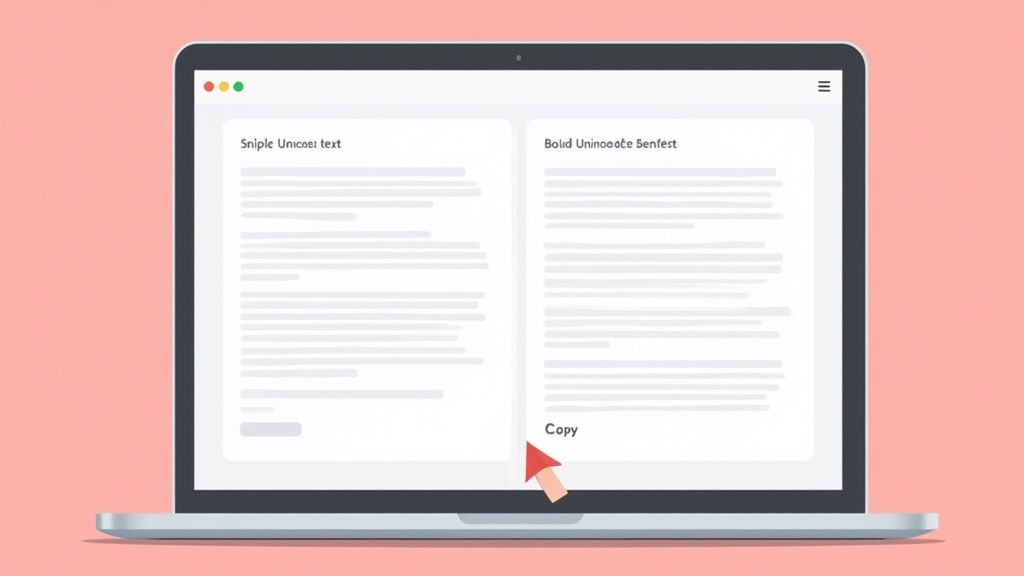
Here’s how simple it is in practice:
- Write or paste your text into the input box (usually on the left).
- Browse the generated styles that pop up on the other side.
- Click to copy the bold style you like the best.
- Paste it directly into your LinkedIn post where you need the emphasis.
The screenshot above shows you exactly what this looks like using LingoJam's tool. I typed in "Stand out with bold text!" and immediately got several bold and italic options ready to go. This instant conversion is what makes these tools so efficient when you're trying to get a post out the door.
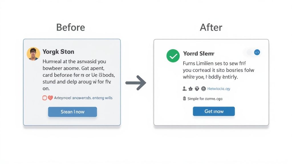
The Big Trade-Off: Visuals vs. Accessibility
While these generators are incredibly convenient, it's really important to understand what's happening behind the scenes. Using them is a choice, and it comes with some serious ethical caveats.
The main benefit is obvious: it's 100% free and takes just a few seconds to do. It’s a quick visual win.
But there are a couple of significant downsides you need to weigh:
- Accessibility Problems: This isn't actually bold text. It's a string of unique symbols. For visually impaired users who rely on screen readers, these characters can be a nightmare. The software might read them aloud as gibberish, spell them out letter by letter, or just skip them entirely, excluding part of your audience.
- Rendering Issues: On some older devices, browsers, or operating systems, these special characters won't display properly. Instead of your cool bold text, your audience might just see a row of empty boxes (□□□).
Ultimately, you're trading visual impact for potential accessibility and compatibility problems. Choosing ethics means ensuring your content is inclusive, a risk that might not be worth it if the bolded words contain critical information.
Best Practices for Using Bold Text Effectively
Alright, so you know the mechanics of how to make your text bold. The real art is learning when to use it. Effective formatting is all about strategic emphasis, not just decorating your post for the sake of it.
If I could give you one piece of advice, it would be this: less is more.
When you bold everything, nothing stands out. It's the digital equivalent of shouting, and most people on LinkedIn will just scroll right past that kind of noise. Your goal should be to guide the reader's eye ethically, not overwhelm it.
When to Use Bold for Maximum Impact
Think of bold text as a spotlight. You wouldn't light up the whole stage, just the main actor. You want to shine it only on the most critical parts of your message—the bits that demand attention from someone scanning their feed.
From my experience, these are the moments where bolding really works:
- To highlight a single, powerful statistic. This draws the eye straight to your most compelling piece of data. Something like, "We saw a 42% increase in engagement."
- To emphasize the key takeaway. If a reader only remembers one sentence, what should it be? Bold that.
- To make your call to action (CTA) impossible to miss. Tell your reader exactly what to do next, like "Comment with your biggest takeaway below!"
This selective approach makes sure your key points land with authority. Of course, none of this matters if your first line doesn't grab them. A powerful and affordable hook generator can help you create attention-grabbing first lines that pull readers in.
Striking the Right Balance with Formatting
To get this right, you have to understand how people behave on LinkedIn. The platform has an average engagement rate of around 6.5%, but here's the kicker: expert analysis shows that between 75-80% of users scan posts instead of reading them word-for-word.
Strategic bolding gives those scanners visual anchors to latch onto. It makes them more likely to stop, react, or comment—all signals the algorithm loves. If you want to dive deeper, the latest social media benchmark reports are a great resource for refining your strategy.
To make this super practical, I've put together a quick cheat sheet.
Do's and Don'ts of Bolding Text on LinkedIn
This table breaks down the simple rules I follow to keep my formatting sharp and effective.
| Effective Use (The Do's) | Ineffective Use (The Don'ts) |
|---|---|
| Emphasize one key metric in a sentence. | Bolding entire sentences or paragraphs. |
| Draw attention to a call to action (CTA). | Bolding random words for visual flair. |
| Highlight names or keywords for scannability. | Mixing bold, italics, and underlines all at once. |
| Break up long lists with bolded lead-ins. | Bolding every other word in a sentence. |
Stick to the "Do's," and you'll be on the right track to creating content that's easy to read and looks professional.
Your formatting should serve one primary purpose: to make your message clearer and easier to absorb for a busy professional. If it adds complexity or visual noise, it’s working against you.
Ultimately, a well-formatted post is a sign of respect for your audience's time. By using bold text thoughtfully, you're not just making your post look good; you're enhancing readability and reinforcing the messages that matter most.
Take Your Formatting Beyond Just Bolding
Alright, now that you know how to make text bold in a LinkedIn post, we can start thinking bigger. Bolding is a fantastic starting point, but it's really just one tool in your formatting kit.
When you start combining bolding with other styles you can get from affordable Unicode generators—like italics or even script fonts—you can create a much clearer visual hierarchy in your posts. This is about more than just making a word pop.
It’s about structuring your content with a clear purpose. Think about it: you could use bold for your main headline, italics for a powerful quote you're sharing, and then use clean Unicode symbols to create a scannable bulleted list. Each element gets its own job, guiding your reader’s eye exactly where you want it to go.
This strategy is an absolute game-changer for LinkedIn carousels. When each slide has well-styled text, it feels more engaging and professional, making it far more likely that people will swipe all the way to the end.
Combine Styles for Maximum Impact
Mixing up your formatting styles adds a professional touch that helps your content stand out from the endless scroll of plain-text posts. The real key here, though, is consistency.
For example, maybe you decide to always use bold for your opening hook and always use italics for secondary points or asides. This creates a predictable and easy-to-follow structure that your audience will subconsciously appreciate.
Of course, a strong headline is everything when it comes to grabbing that initial attention. You can use our handy and affordable headline generator to craft compelling opening lines that are practically begging to be bolded.
Remember, the goal here isn’t just to decorate your post. It’s to make your key information as clear and accessible as possible for someone who is flying through their feed.
And this isn't just about looks; styling your text has a measurable impact on engagement, especially with carousels. It's no secret that in 2025, carousels are still king on LinkedIn, commanding the highest engagement at 5.9%. People spend 15 to 20 seconds on them—that’s almost double the time they give other post types.
We've seen that posts formatted with bold text and a strong opening line get a 20-30% increase in dwell time. That makes them far more likely to be seen and shared. You can dig into more insights on how post formatting drives engagement on Ysobelle-Edwards.co.uk.
Before you even get to formatting, it's worth making sure your core message is polished. To really refine your copy, you might want to look into a tool like an AI text enhancer. These can help tighten up your writing, ensuring the message itself is just as strong as its visual presentation. By thoughtfully combining great copy with smart styling, you create a much more dynamic and memorable reading experience.
Hold On, There's a Catch: The Risks and Ethics of "Fake" Bold Text
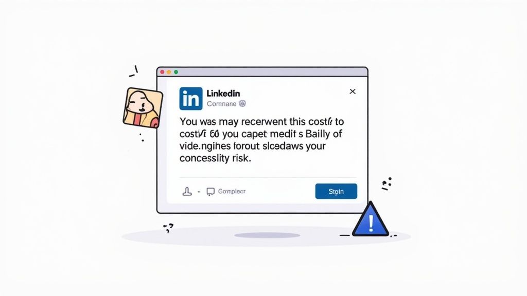
Before you go all-in on Unicode, you need to understand what’s actually happening behind the scenes. Using these generators is a neat trick, but it comes with some serious ethical baggage. The biggest concern? Accessibility.
Those bold characters aren't really bold text. They're unique symbols from a different part of the Unicode library. For someone using a screen reader due to a visual impairment, this creates a huge problem. Their software might read your post as complete gibberish, spell out each character one-by-one, or just skip it entirely.
Your message, no matter how powerful, becomes completely inaccessible. This is an ethical choice: prioritize a visual effect or ensure everyone can access your content.
Beyond Accessibility: Compatibility and Professionalism
The issues don't stop there. Have you ever seen text on a website that just shows up as a bunch of empty boxes (□)? That’s what can happen when you use these special characters. Your carefully crafted post might look broken on older devices or operating systems.
And honestly, overdoing it can make your content look spammy or unprofessional. Think about it—if every other word is bold, it just becomes noise. It's also worth remembering how platforms handle user-generated content moderation; while unlikely to get you penalized, bizarre formatting can sometimes make posts look less credible.
When you're thinking about how to bold text in a LinkedIn post, you have to weigh the visual pop against the ethical need for inclusivity. Your ultimate goal should be to create content that’s engaging for everyone in your professional network, not just those who can see it the way you do.
Ultimately, using this method is a balancing act. It can be effective, but only if you use it thoughtfully and without excluding members of your audience.
Frequently Asked Questions About LinkedIn Formatting
Even with a few solid tools in your back pocket, you probably still have some questions floating around about making text bold in your LinkedIn posts. Let's tackle the most common ones I hear.
Why Can I Bold Text in an Article but Not a Post?
This one trips a lot of people up. You’ve likely noticed that when you write a LinkedIn Article, you get a full-blown text editor with all the bells and whistles—bold, italics, headers, the works. But when you create a standard post, those options vanish.
Here's the deal: LinkedIn treats Articles like long-form blog posts, giving them rich formatting capabilities to match. The main feed, on the other hand, is designed for shorter, simpler, more immediate updates. The platform intentionally keeps the post composer minimal to encourage quick, scannable content.
Will Using Bold Text Hurt My Post's Reach?
This is the million-dollar question, and the answer isn't a simple yes or no. The LinkedIn algorithm doesn't directly look for Unicode characters and penalize your post for using them. Instead, it obsesses over one thing: engagement.
If your strategic and ethical use of bold text makes your post clearer and more readable, it can actually boost engagement. More likes and comments signal to the algorithm that your content is valuable, which can improve its reach.
The flip side is also true. If you go overboard and your post looks spammy or becomes inaccessible, people will scroll right past it. That lack of engagement tells the algorithm to show it to fewer people. Ultimately, the algorithm responds to how your audience behaves, not the formatting itself.
Your focus should always be on readability and delivering value. Good formatting supports great content; it can't save bad content. For more common queries, check out our complete guide on the Contentide FAQ page.
What Are the Best Mobile-Friendly Bold Text Tools?
Creating content on the go is a non-negotiable for busy professionals. When you're working from your phone, you don't want to be fumbling with clunky apps.
For mobile users, web-based generators like YayText or LingoJam are still the undisputed champs. They’re fast, free, and don’t require you to download yet another app, making them a perfectly affordable solution. They work perfectly in any mobile browser, letting you copy your formatted text and paste it directly into the LinkedIn app in seconds.
Tired of manually formatting every post? Contentide is an AI-powered content generator that helps you create authentic, high-performing LinkedIn posts in minutes, with formatting built right in. It's an affordable tool designed for professionals. Start creating for free at https://contentide.com.
Hope you found this helpful. Feel free to share your thoughts.