A Guide to the Perfect LinkedIn Carousel Size
Master the optimal LinkedIn carousel size for maximum impact. This guide offers dimensions, specs, free templates, and tips to boost engagement.

Before you even think about the content for your next LinkedIn carousel, you have to get the technical specs right. It's the foundation. Mess up the dimensions, file types, or sizes, and you risk blurry images, awkward crops, or slow load times—all of which are guaranteed to make people scroll right past your hard work.
Nailing the platform guidelines is the first, and maybe most important, step to creating a carousel that looks polished and professional.
Your Quick Reference for LinkedIn Carousel Specs
To make it easy, I've put together a quick reference guide that summarizes all the essential specs you need for your carousels. Think of it as your pre-flight checklist.
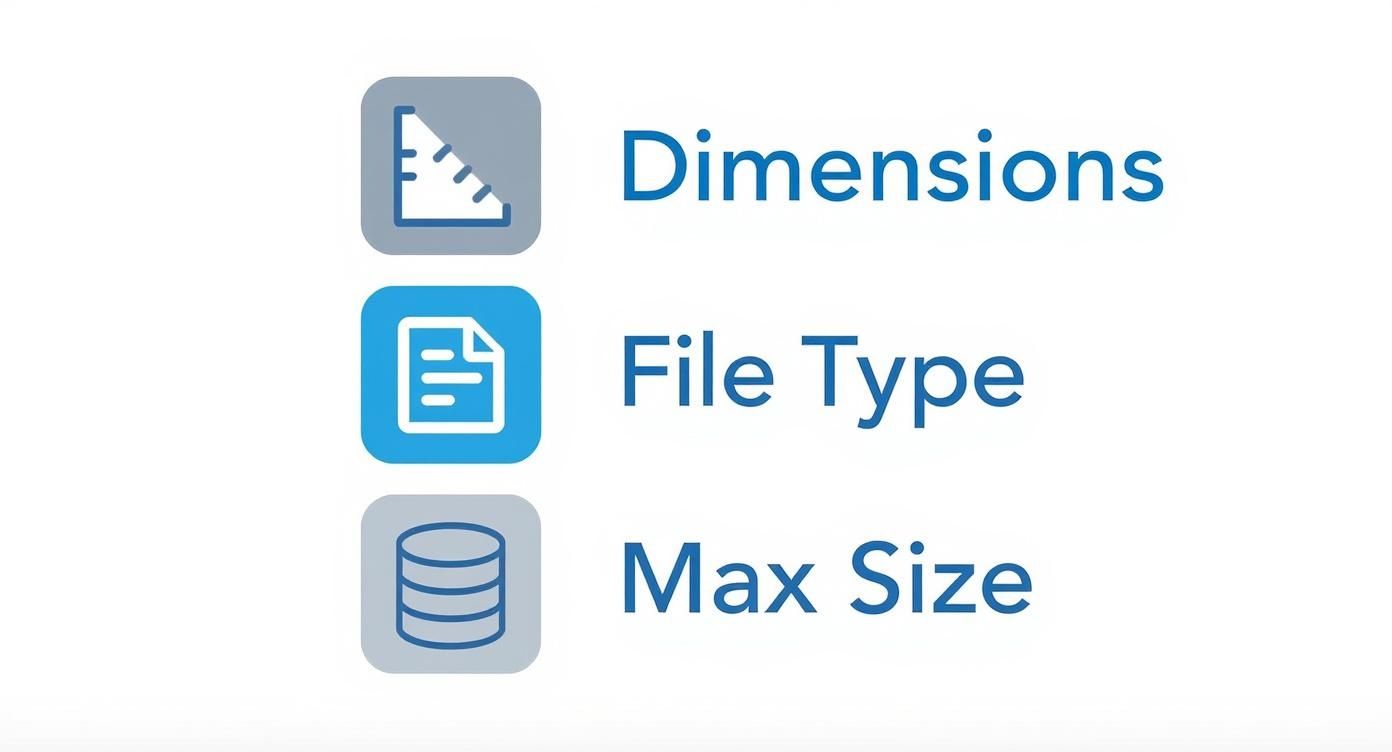
This visual breaks down the must-know specs for dimensions, file formats, and maximum sizes. It’s perfect for a quick check before you hit publish.
To give you an even faster lookup, here are the core technical specs in a simple table.
LinkedIn Carousel Quick Specs
Here's a quick rundown of the most important technical details for building a LinkedIn carousel.
| Specification | Recommendation |
|---|---|
| Dimensions (Square) | 1080 x 1080 pixels |
| Dimensions (Portrait) | 1080 x 1350 pixels |
| Aspect Ratio (Square) | 1:1 |
| Aspect Ratio (Portrait) | 4:5 |
| Recommended File Type | PDF (also supports PNG, JPG) |
| Max File Size | 10 MB for images, 100 MB for PDF/DOC/PPT |
| Max Page/Slide Count | 300 pages (but 5-15 is the sweet spot) |
Getting these settings right from the start in your design tool of choice—whether it's Figma, Canva, or PowerPoint—will save you a ton of headaches later on.
Key Dimensions and File Limits
LinkedIn has really standardized its recommendations, pushing for either 1080 x 1080 pixels for square carousels or 1080 x 1350 pixels for the portrait format.
There's a very good reason for the emphasis on the 4:5 portrait size. Roughly 57% of all LinkedIn engagement now happens on a mobile device. That taller format simply takes up more screen real estate on a phone, grabbing more attention as people scroll through their feed. It’s a small detail that makes a big difference.
If you want a complete breakdown of all the technical requirements for every type of content on the platform, the Ultimate Guide to LinkedIn Post Specs is an excellent resource. It covers everything from single images to video.
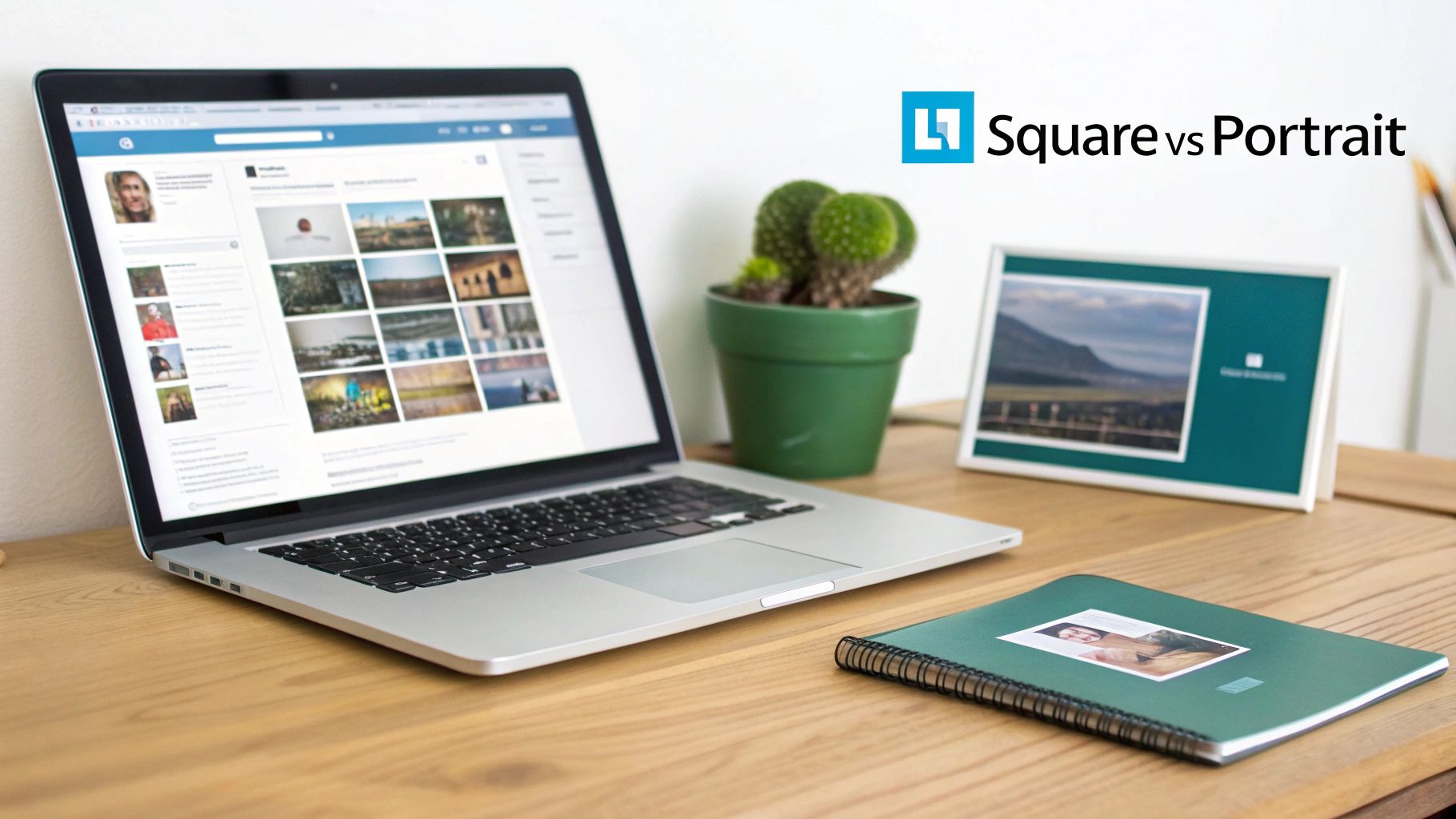
Choosing the Right Dimensions and Aspect Ratio
Picking the right size for your LinkedIn carousel isn't just a technical detail—it's a strategic choice that dictates how people will see and engage with your work. You really have two main paths to choose from: the ultra-compatible square or the scroll-stopping portrait. Each has its place, and the best one for you depends entirely on what you're trying to achieve.
The Reliable Workhorse: 1:1 Square
The square format, with a 1:1 aspect ratio, is your safest bet. The standard here is 1080 x 1080 pixels, and its superpower is consistency. It just works. You can be confident it'll look clean and predictable on both desktop and mobile feeds, with no awkward or unexpected cropping.
This makes it a no-brainer for infographics, charts, or any design where every single pixel matters. If you need to make sure your audience sees the whole picture, every time, the 1:1 square is your go-to.
Think of the 1:1 ratio as your guarantee for a uniform viewing experience. It prevents key information from getting chopped off, no matter what device someone is using. It’s the reliable choice for clear, cross-platform communication.
Maximizing Mobile Impact: 4:5 Portrait
While the square format is dependable, the portrait orientation is built for grabbing attention, especially on mobile. With a 4:5 aspect ratio (1080 x 1350 pixels), this taller format takes up way more screen real estate in a user's feed. That extra vertical space is a powerful way to make someone pause their scroll and hold their attention.
This taller format is especially powerful for:
- Visual Storytelling: You simply have more room for compelling images and text that builds a narrative.
- Showcasing Products: It lets you use larger, more detailed product shots that really capture the finer details.
- Personal Branding: Portrait carousels are perfect for featuring prominent headshots or personal photos that help build a genuine connection.
If you ever need to double-check your math or explore other sizes, a good online aspect ratio calculator tool is incredibly useful for keeping things proportional.
The bottom line is this: choose your dimensions based on your primary goal. If your audience is mostly on mobile and your content is highly visual, the 4:5 portrait format gives you a serious competitive edge. For a balanced approach or for content heavy on data, the 1:1 square is still the gold standard for clarity.
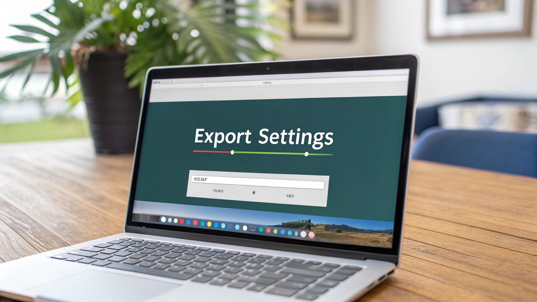
Optimizing Your Carousel Files and Export Settings
Once you've nailed the design, the final hurdle is exporting it correctly. Mess this up, and all your hard work can look blurry or take forever to load on LinkedIn. Getting the file format and export settings right is absolutely critical—it's what ensures your carousel looks sharp and professional in the feed.
For any carousel with multiple slides, your go-to format should always be PDF. It wraps everything up into one neat document that LinkedIn handles beautifully, keeping your text crisp and your layout intact. While you can upload a series of individual JPG or PNG files, that's really a different type of post (a native image gallery) and isn't the standard way to create a document carousel.
File Format and Quality Settings
A couple of technical details during export can make a world of difference. Think of these as the final polish that ensures your content looks professional and doesn't leave anyone waiting.
- Resolution (DPI): Set your export resolution to 300 DPI (dots per inch), no exceptions. This is the secret to keeping your text and images looking sharp and avoiding that dreaded pixelated or blurry look, especially on high-res screens.
- Color Mode: Stick with RGB (Red, Green, Blue). It’s the universal standard for digital screens, so using it guarantees your colors will show up on computers and phones exactly as you designed them.
Your goal is to find that sweet spot between visual quality and performance. A gorgeous, high-res carousel that takes ages to load is just as bad as a blurry one that loads instantly.
Balancing File Size and Performance
Finally, keep a close eye on that file size. LinkedIn technically allows PDFs up to 100 MB, but uploading anything close to that is a recipe for a terrible user experience. Nobody wants to wait for a massive file to load, especially on a spotty mobile connection.
A good rule of thumb I always follow is to keep the final PDF under 3 MB. This size is the perfect balance—it delivers stunning visual quality without forcing your audience to wait. It’s a small detail that ensures your content is accessible and engaging for everyone who scrolls by.
Finding the Ideal Slide Count for Engagement
Once you’ve nailed the LinkedIn carousel size, the next big question is always: how many slides should I actually use? The platform technically lets you upload a document with up to 300 pages, but trust me, creating a carousel that long is the fastest way to lose your audience. More is definitely not better here.
The real goal is engagement, not exhaustion.
It all comes down to finding that perfect balance between delivering real value and respecting people’s time. If you overwhelm them with too much information, they’ll just swipe away before ever reaching your final, most important slide.
The Sweet Spot for Carousel Length
After looking at the data and talking with countless creators, a clear pattern emerges. The sweet spot for a high-performing LinkedIn carousel is usually somewhere between 6 and 12 slides. This range gives you just enough room to tell a compelling story, teach something useful, and guide your reader toward an action—all without causing swipe fatigue.
Sure, LinkedIn allows for those massive 300-page documents, but real-world engagement stats show a huge drop-off in completion rates for carousels that go past 12 slides. This isn't a bad thing; it's a helpful constraint. It forces you to be concise and make every single slide count.
Structuring Your Carousel for Maximum Impact
A great carousel isn't just a random collection of slides. It’s a story. It needs a clear beginning, a valuable middle, and a purposeful end. To keep people swiping, each slide has to build on the last and make them curious about what’s coming next.
A structure that consistently works has three core parts:
- The Hook (Slide 1): Your first slide is everything. It has to stop the scroll. Grab their attention immediately with a bold headline, a provocative question, or a statistic that makes them think. If you’re stuck on that opener, a good hook generator can give you some solid ideas to get started.
- The Value-Packed Middle (Slides 2-9): This is the heart of your carousel. Each slide should deliver one clear piece of information—a practical tip, a step in a process, a key insight. Keep the text minimal, let strong visuals do the heavy lifting, and make sure there's a logical flow from one slide to the next.
- The Call-to-Action (Final Slide): Don't just end it. Tell your audience exactly what you want them to do next. Whether it's asking a question to spark comments, encouraging them to share, or directing them to a link in the post, a clear CTA is what turns a passive viewer into an active participant.
Designing Accessible and Reader-Friendly Carousels
Getting your LinkedIn carousel dimensions right is only the first step. If you want your content to actually connect with people—and I mean all people—it needs to be inclusive, accessible, and easy to read. Otherwise, you're just creating pretty pictures that a huge chunk of your potential audience can't engage with.
Think about safe zones. These are the invisible margins you need to respect on every slide. All your critical text, logos, and graphics should live comfortably inside these zones. This simple habit prevents LinkedIn’s own interface—like profile pictures or navigation buttons on different devices—from awkwardly cropping your most important points.
Creating an Inclusive Experience
Designing with accessibility in mind isn't a box-ticking exercise or just a matter of compliance. It’s an ethical commitment. It’s about making a deliberate choice to ensure your insights are available to the widest possible audience, including those with visual impairments.
Here’s what that looks like in practice:
- High Contrast is Non-Negotiable: Your text has to stand out from its background. Light grey text on a white background might look minimalist, but it's a nightmare for many readers. Use online tools to check your color palettes against Web Content Accessibility Guidelines (WCAG) standards.
- Choose Legible Fonts: This is not the place for overly decorative, script, or ultra-thin fonts. Stick with clear, simple typefaces that hold up well, especially when viewed on a small mobile screen.
- Bump Up the Font Size: Don’t make people squint. For a standard 1080px wide design, a good baseline for your body text is a minimum of 24pt. It might feel big at first, but it makes a world of difference for readability.
- Keep Your Copy Lean: One slide, one idea. Seriously. Don't cram dense paragraphs onto a single image. Break down complex thoughts into digestible, single-sentence points to avoid overwhelming your reader.
When you prioritize readability and strong contrast, you're not just improving accessibility. You're creating a better, less strenuous viewing experience for every single person who comes across your carousel.
Finally, don't skip LinkedIn’s alt text feature when you upload your document. Take a moment to write a brief, descriptive summary of what the carousel is about. This is what screen readers use to describe your content to visually impaired users, making your work genuinely accessible to everyone.
Free Templates and Affordable Creation Workflows
Making a high-impact carousel doesn’t have to drain your wallet or your schedule. You can produce professional-quality content with accessible, affordable tools and a smart workflow that gets the job done right.
Platforms like Canva and Figma have completely changed the game for creators by tearing down the technical barriers. Both offer free plans that are more than powerful enough for most users, letting you set up your document with the correct LinkedIn carousel size from the get-go. No more guesswork.
Setting Up Your Document in Canva
Getting started in Canva is dead simple. A quick search for "LinkedIn post" unlocks thousands of ready-to-use templates already optimized for the feed. This means you can skip manually plugging in dimensions like 1080 x 1080 pixels.
You'll find an incredible variety of templates, which you can filter by style, theme, or color to perfectly match your brand's vibe.

These templates give you a solid visual foundation, so you can pour your energy into crafting a compelling message instead of wrestling with design elements from scratch.
Starting with a pre-sized template isn't just a time-saver—it's a shortcut to a proven layout. This workflow helps you maintain the high quality and consistency that are so crucial for building a memorable brand on LinkedIn.
Once you’ve picked a template, you can tweak every single element to align with your brand's look and feel. From there, it’s as easy as duplicating a slide for each part of your carousel and then exporting the whole project as one high-quality PDF.
For more inspiration on structuring your content, check out the resources over on the Contentide blog. This affordable workflow makes creating engaging carousels genuinely efficient, turning consistent posting from a goal into a reality.
Frequently Asked Questions About Carousel Sizes
When you're deep in the design process, a few nagging questions about LinkedIn carousel sizes can pop up. Let's clear up the most common ones so you can get back to creating.
Can I Use Different Sizes in One Carousel?
Nope, this is a hard and fast rule. Every single slide in your carousel PDF has to be the exact same size. You have to commit to either 1080 x 1080px square or 1080 x 1350px portrait for the entire document.
LinkedIn takes its cue from the very first page. If you mix and match dimensions, it will force everything to conform to that first slide's size, leading to some seriously weird cropping and a broken user experience.
Honestly, the biggest mistake I see people make is mixing slide sizes. The easiest way to avoid this headache is to set up a single, consistent artboard or page size in your design tool before you even start.
What Is the Maximum File Size?
Technically, LinkedIn says you can upload a PDF up to 100 MB. But you should never, ever get that close.
For the real world, aim to keep your final exported PDF under 3 MB. A smaller file means a faster load time, which is absolutely critical for keeping someone's attention, especially on a mobile connection. A massive file is just asking for people to swipe away before your content even appears.
Still have a few questions about getting your workflow just right? We've got more in-depth answers over in our comprehensive FAQ section.
Ready to create high-performing LinkedIn content in minutes? Contentide uses AI to turn your ideas into polished, authentic posts and carousels that sound just like you. Stop staring at a blank page and start building your brand today. https://contentide.com
Hope you found this helpful. Feel free to share your thoughts.