The Ultimate Guide to LinkedIn Post Image Size
Master the perfect LinkedIn post image size for every format. Our guide covers dimensions, ratios, and best practices for professional, high-engagement visuals.

If you want your images to look sharp and professional in the LinkedIn feed, your best bet is to use either 1200 x 627 pixels for a landscape image or 1200 x 1200 pixels for a square one. Nailing these dimensions is the first, and maybe most important, step to creating content that stops the scroll without needing expensive design software.
Your Quick Reference for LinkedIn Image Sizes
Getting your image dimensions right avoids that dreaded awkward crop and ensures your visuals have the impact you intended. While LinkedIn is somewhat flexible, certain sizes are perfectly optimized for how the feed displays content on both desktop and mobile.
For a standard shared image post, the sweet spot is 1200 x 627 pixels. This creates a clean, professional-looking image that fits the classic 1.91:1 landscape aspect ratio favored by the platform. You'll see this ratio used across many social platforms, a topic covered well in this guide on Post Planner.
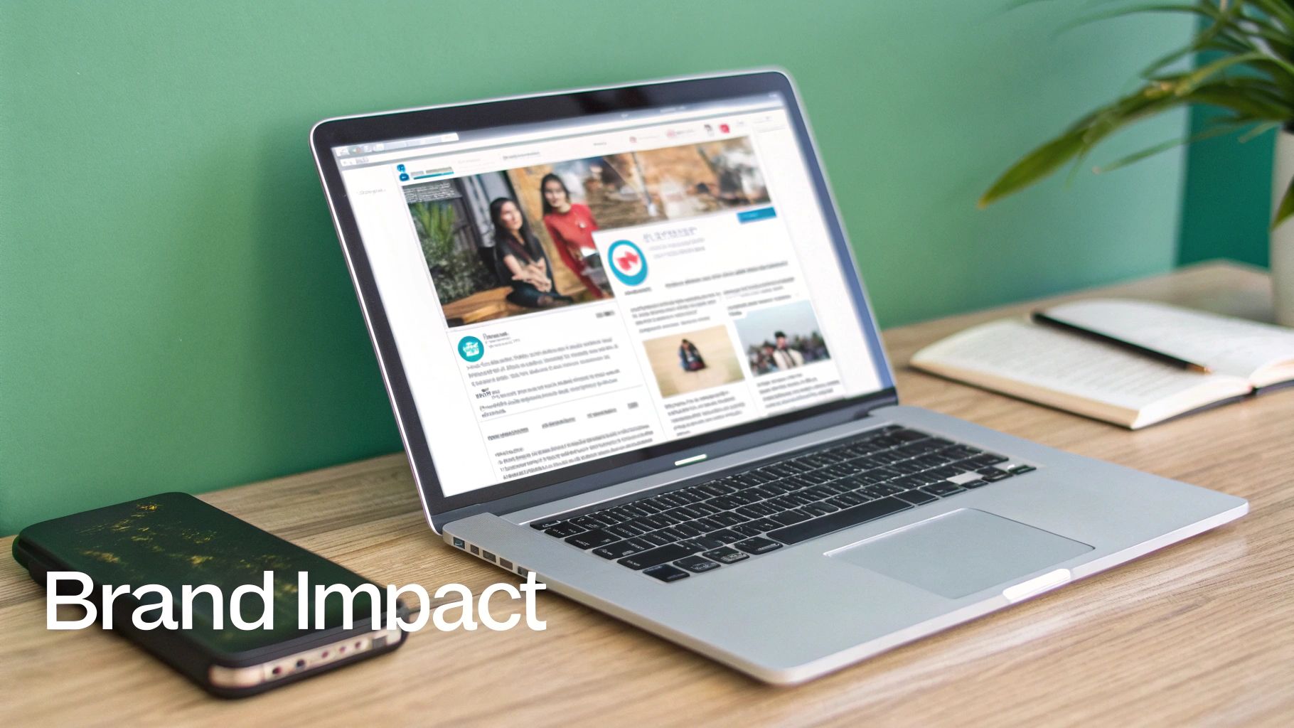
This simple visual breaks down the two most effective post sizes at a glance.

As you can see, both the landscape and square formats are your go-to options for creating clean, high-impact posts that look great in the feed.
Choosing the correct size is about more than just aesthetics; it's a signal. A properly formatted image tells your audience you're detail-oriented and professional, which builds trust and encourages them to engage with what you have to say.
It's a small detail, but using the right image dimensions is a powerful way to show professionalism on LinkedIn. It proves you care about your audience's experience.
If you're focused on creating consistently great content, you can find more strategies and tips over on the Contentide blog. Ultimately, taking a moment to master these specs will save you a ton of frustration and help your message land exactly as you planned it.
Why Getting Your Image Specs Right Matters
Let’s be honest—the technical specs for a linkedin post image size aren't just numbers. They're the foundation of a strong professional brand. Every time you share an image on LinkedIn, you're making a statement about your attention to detail and the quality of your work.
Think about it. An image that's pixelated, stretched, or awkwardly cropped sends a subtle message: "I didn't have time to get this right." It can weaken your point before anyone even reads your text.
Nailing the dimensions ensures your visuals show up exactly as you planned, no matter what device your audience is using. No more cut-off text or weirdly framed logos. It’s a small detail that communicates competence and builds a quiet layer of trust with your viewers.
This isn’t just about aesthetics, either. This attention to detail has a direct and measurable impact on how your content actually performs.
The Link Between Image Quality and Engagement
I’ve seen it time and time again: there's an undeniable link between correctly formatted visuals and audience engagement. High-quality, optimized images are scroll-stoppers, plain and simple. They lead directly to higher interaction rates.
Why? Because the platform’s algorithm rewards content that creates a good user experience.
An image that fits perfectly in the feed isn't just about looking good; it's a strategic tool. It's more likely to be seen, clicked, and shared, which amplifies your reach and impact.
In fact, LinkedIn posts with properly sized images can pull in up to 2x more engagement than posts with wonky visuals or no images at all. That’s a huge boost if you're trying to build influence or generate leads on the platform.
Protecting Your Professional Image
Every single thing you share contributes to your digital reputation. When you consistently use the correct LinkedIn post image size, you reinforce your brand as credible and authoritative. It shows you value quality and are committed to presenting your ideas in the best possible light.
This applies to your profile, too. For instance, if you want to make sure your profile picture is always sharp and professional, a guide on AI Generated Headshots for LinkedIn can offer some really innovative solutions.
Ultimately, taking a few extra moments to get your images right is a small step, but it’s a powerful one in leveling up your entire LinkedIn strategy.
Mastering Single Image Posts for Maximum Impact
The single image post is the absolute workhorse of LinkedIn. Getting its dimensions right isn't just a technical detail; it's fundamental to making a strong first impression. This format is versatile, easy to create, and incredibly effective when you know how to dial it in.
The two main players you'll be working with are landscape and square. Each has its own strategic purpose.
For that classic, wide look, the recommended linkedin post image size is 1200 x 627 pixels. This gives you a 1.91:1 aspect ratio that fills the feed horizontally on desktop, giving your visuals a more cinematic feel. It's a great choice for detailed graphics, event banners, or team photos where you need that extra width.
But while landscape is the old standard, the square format is quickly becoming the go-to for savvy creators.
The Power of the Square Post
The sweet spot for a square image is 1200 x 1200 pixels, a perfect 1:1 aspect ratio. The big win here is how it performs on mobile. Since most people are scrolling LinkedIn on their phones, a square image simply takes up more vertical screen real estate. It's bigger, bolder, and much harder to just scroll past.
That extra space is gold. It gives you more room for powerful visuals and clear text overlays, helping your post stop the scroll in a crowded feed. It's ideal for infographics, quote cards, and any graphic where you're trying to maximize visibility.
Here’s a perfect example of how a well-composed image completely owns the mobile screen.
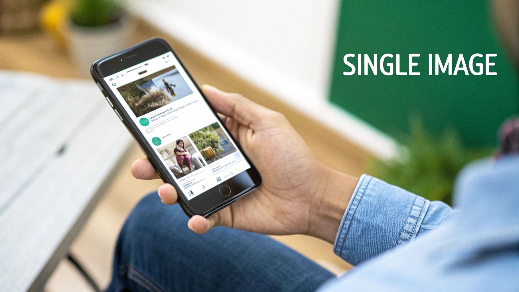
You can see how a properly sized visual commands attention, drawing your eye right to the content.
Best Practices for Composition
No matter which dimensions you pick, how you design the image is just as important. Your visuals and your words need to team up to deliver a single, powerful message.
Focus on a Central Subject: Place the most important part of your image—a person, a product, a key piece of data—right near the center. This is your insurance against awkward cropping, especially as LinkedIn makes small adjustments for different screen sizes.
Keep Text Overlays Minimal: If you’re adding text, make it bold, clear, and brief. Don't try to cram your entire post into the image. Your visual's job is to grab attention and plant a core idea. The post copy is where you elaborate. For ideas on punchy opening text, a good hook generator can help you craft an engaging first line.
Maintain Brand Consistency: Use your brand’s colors, fonts, and logo consistently. This is how you build recognition over time, making your content instantly identifiable to your followers as they scroll.
Pro Tip: Always, always preview your post on both mobile and desktop before you hit "Post". Something that looks perfect on your big monitor can become a jumbled, unreadable mess on a small phone screen. A quick check takes seconds and ensures your message lands perfectly with your entire audience.
Optimizing Carousel and Multi-Image Posts
Carousel posts are one of the best ways to tell a detailed story or showcase multiple products on LinkedIn. Instead of banking everything on a single visual, they let you guide your audience through a sequence of images. It's a much more interactive and in-depth experience, but getting them right means understanding how LinkedIn handles multiple images.
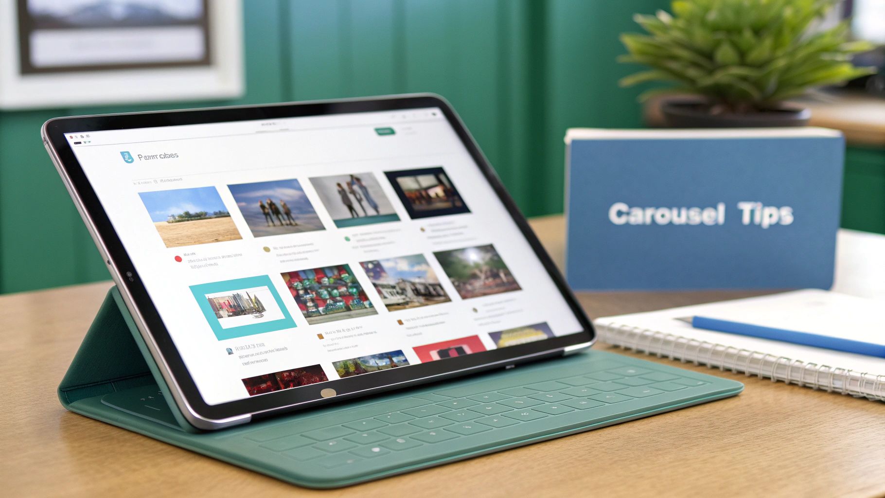
Unlike a single image post that gives you some flexibility, carousels almost always perform best when you stick to a consistent LinkedIn post image size. For that seamless, professional look across every slide, your go-to should be the square 1:1 aspect ratio. I always recommend using 1200 x 1200 pixels for each image.
This square format is key. It ensures none of your images get awkwardly cropped as people swipe, which keeps the visual narrative clean and cohesive from the first slide to the last.
Designing a Cohesive Narrative
A great carousel isn't just a collection of random images—it's a visual story. Each slide has to build on the one before it, leading your audience toward a specific conclusion or call to action. I like to think of it as a mini-presentation where every single image has a job to do.
Here are a few practical tips I've picked up for designing carousel cards that work together:
- Number Your Slides: It's a simple trick, but adding "1/5," "2/5," etc., to each image encourages people to swipe all the way through. It sets an expectation and makes the content feel more structured and complete.
- Maintain Consistent Branding: Use the same fonts, color palette, and logo placement on every slide. This kind of visual consistency reinforces your brand identity and makes the whole carousel feel like one polished piece of content.
- Craft a Strong Final Slide: Your last image is your final shot to make an impact. Use it for a powerful summary, a clear call-to-action (CTA), or your contact info. Don't just let the story trail off—end with a purpose.
A well-designed carousel guides the viewer on a journey. The goal is to make swiping feel intuitive and rewarding, keeping them engaged until your final message.
By sticking to the 1200 x 1200 pixel size and focusing on a clear narrative flow, your multi-image posts can become some of the most powerful content in your arsenal. This approach transforms a simple post into an effective communication tool that can capture and hold your audience's attention for much longer than a single image ever could.
Perfecting Your Link Preview Images
When you share a link to your latest blog post or company news, LinkedIn automatically pulls a preview image from that webpage. This thumbnail is your first—and often only—chance to grab someone's attention and earn that click. Getting this right is a critical, yet frequently overlooked, part of a professional LinkedIn presence.
To make sure your link preview shows up as a large, compelling banner, the optimal image size is 1200 x 627 pixels. This specific 1.91:1 aspect ratio is the key to avoiding that dreaded tiny thumbnail that gets completely lost in the feed.
This isn’t just a random number. LinkedIn has standardized its image sizes over time to create a more consistent visual experience for users globally. While post images often use a 1200 x 1200 pixel square format, link shares stick to the 1200 x 627 pixel rectangle. You can discover more insights about these social media standards and see how they’ve changed over the years.
Troubleshooting Common Link Preview Issues
Even with the right dimensions, you might still run into problems. The most common headaches are LinkedIn pulling the wrong image or showing a blurry, poorly cropped version of the right one. Luckily, these are usually easy to fix by checking your website’s metadata.
This metadata, specifically the Open Graph (OG) tags, is what tells social platforms which image, title, and description to use when someone shares a link.
Pro Tip: If you've updated an image but LinkedIn is stubbornly showing an old version, use LinkedIn’s free Post Inspector tool. Just paste your URL into the tool, and it forces LinkedIn to clear its cache and fetch the latest version of your page. Problem solved.
To guarantee every link you share looks polished and professional, you need to have the correct OG tags in place on your website. Here’s a simple checklist to run through with your developer or marketing team:
og:imagetag: This tag must point directly to the URL of your desired 1200 x 627 pixel image.og:titletag: This defines the headline that appears in the preview. Make it count.og:descriptiontag: This sets the short summary text that shows up below the title.
By setting up these tags correctly, you take full control over how your content appears. It's the difference between a sloppy share and a polished, click-worthy post.
Smart File Optimization and Compression Tips
Getting your LinkedIn post image size right is about more than just pixel dimensions. The file type you choose and its overall size are just as critical for making sure your images load fast and look sharp. A massive, uncompressed image will slow down the user experience, especially on mobile, and that can tank your post's performance before anyone even sees it.
The two workhorses you'll be using are JPG and PNG. Knowing which one to pick comes down to what's in your image.
- JPG (JPEG): This is your best friend for photographs. JPGs use a smart compression method that's fantastic at handling the complex colors and smooth gradients you find in photos. It keeps file sizes nice and small without a big, noticeable drop in quality.
- PNG: This format is the clear winner for graphics with sharp lines, text, or logos—think infographics, charts, or quote cards. PNGs preserve those crisp details perfectly, avoiding the fuzzy artifacts that can sometimes creep into a compressed JPG.
Balancing Quality and Performance
Once you've picked the right format, the next step is compression. Your goal here is to shrink the file size as much as you can without turning your beautiful image into a blurry, pixelated mess.
A solid rule of thumb is to keep your image files under 5 MB. That's the sweet spot to ensure they load almost instantly for pretty much everyone.
You don't need fancy, expensive software for this. Plenty of great online tools can handle the job. To get your images dialed in to the exact specs for different post types, using an effective image resizer is a huge help. These tools make the whole process of resizing and compressing your visuals incredibly simple.
Here’s a pro tip: Always save a copy of your high-resolution original before you start compressing. If you get a little too aggressive and lose too much quality, you can just go back to the original and try again without having to start from scratch.
This little bit of extra effort shows you're not just creating content, but you're crafting a great experience for your audience. Optimizing your files is a small signal of professionalism that strengthens your brand with every single post.
Frequently Asked Questions About LinkedIn Images
Getting the details right on your LinkedIn post image size can feel a bit tricky sometimes. I get a lot of questions about this, so I’ve put together some quick, straightforward answers to the most common ones. This should help you troubleshoot any issues and post with total confidence.
What Happens If My Image Has the Wrong Aspect Ratio?
This is a big one. If you upload an image with a non-standard aspect ratio, like a tall 9:16 vertical photo from your phone's camera roll, LinkedIn is going to automatically center-crop it to make it fit.
The result? You'll often see the top and bottom of your image completely chopped off, which can ruin the entire point of your post. To avoid this, always pre-crop your image to the recommended 1.91:1 landscape or 1:1 square ratio before you upload it. That way, you have full control over how it looks.
Can I Use Animated GIFs in LinkedIn Posts?
Absolutely. LinkedIn fully supports animated GIFs, and they're a fantastic way to add a bit of energy to your content.
You should treat a GIF just like a standard image post. Aim for a square (1:1) or landscape (1.91:1) aspect ratio for the best look in the feed. One quick tip: try to keep your GIF file size under 5 MB. This ensures it loads quickly for everyone, especially those scrolling on their phones.
How Do I Update a Link Preview Image?
Ever shared a link and LinkedIn pulled up an old, ugly, or just plain wrong preview image? It’s a common frustration, and thankfully, the fix is easy.
The image that shows up is pulled from that webpage's Open Graph (OG) meta tags. To force LinkedIn to fetch the latest version, you need to use its own "Post Inspector" tool. Just paste your URL into the tool, and it will refresh LinkedIn’s cache and grab the most current og:image from your site. The next time you share that link, the correct preview image will appear.
For more detailed answers to common content questions, you can always check out our full FAQ page.
Ready to stop worrying about image sizes and start creating high-impact LinkedIn content in minutes? Contentide uses AI to turn your ideas into polished, authentic posts that get noticed. Generate a month's worth of content effortlessly and watch your network grow. Try Contentide for free today!
Hope you found this helpful. Feel free to share your thoughts.