Your Guide to LinkedIn Post Image Sizes
Master LinkedIn post image sizes with our complete guide. Get the correct dimensions for single images, carousels, and profiles to maximize your impact.

When it comes to LinkedIn posts, the two most reliable image sizes are 1200 x 627 pixels for a classic landscape look, and 1200 x 1200 pixels for a clean, modern square. Nailing these dimensions from the start is an easy, no-cost way to ensure your visuals show up sharp and uncropped on both desktop and mobile, giving them the impact they deserve in the feed.
Your Quick Reference Guide to LinkedIn Image Sizes
Getting your image dimensions right is probably the single fastest way to make your LinkedIn content look more professional. We've all seen it: blurry, pixelated, or awkwardly cropped pictures that completely undermine the message. This guide is built for busy professionals who need accurate, straightforward information without the fluff.
Using the correct sizes means your content displays exactly as you intended, grabbing your audience's attention right away. On a platform where visual appeal is so closely tied to engagement, this isn't a small detail—it's an essential, easy win.
The image below breaks down the two most common and effective options for single-image posts.
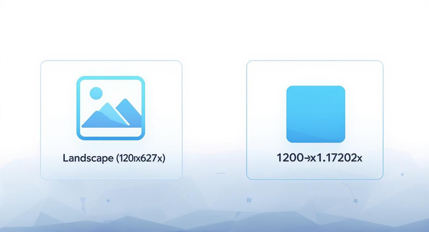
As you can see, your main choice is between a traditional landscape format or a mobile-friendly square. Don't underestimate the power of a good visual; research consistently shows that posts with images get a staggering 98% higher comment rate than plain text updates. The 1200 x 627 and 1200 x 1200 pixel formats work so well because they take up significant real estate in the feed, making your content much harder to ignore.
And if you're managing content across multiple networks, it's smart to have a single source of truth. Bookmark a comprehensive social media image dimensions guide to keep your visuals consistent everywhere you post.
Why Optimized Image Sizes Boost Your Reach
Getting your LinkedIn image sizes right is about way more than ticking a technical box—it’s a core piece of your content strategy. The right dimensions directly impact how people see your brand and how the LinkedIn algorithm treats your posts. When an image is properly sized, it shows up sharp and clear, without weird cropping or pixelation. Your message lands exactly the way you meant it to.
That immediate visual quality telegraphs professionalism and builds trust. A blurry or badly cropped image, on the other hand, can make your content feel sloppy and rushed, giving people a reason to scroll right past. First impressions are everything, and in a crowded feed, a crisp, well-composed visual is your first shot at grabbing someone's attention.
Maximize Engagement and Visibility
The biggest payoff for getting your sizing correct is a serious bump in engagement. Images that look good are simply easier and more enjoyable to consume, which naturally encourages more likes, comments, and shares. LinkedIn’s algorithm values content that people engage with, so that initial boost can lead to much greater visibility and a broader reach for your posts.
It's easy to make mistakes with the wrong dimensions. Common errors can kill your post's impact:
- Awkward Cropping: Key parts of your image or crucial text can get chopped off, especially on mobile.
- Pixelation: An image that's too small will be stretched to fit, making it look blurry and unprofessional.
- Lower Click-Through Rates: A distorted or unappealing image just isn't going to convince someone to click your link or read what you have to say.
Ultimately, knowing why optimized LinkedIn image sizes matter empowers you to create content that doesn’t just look great, but actually performs better. It ensures all the work you put in—from designing the perfect visual to crafting a killer caption—hits its full potential. When you nail the visuals and pair them with a title that grabs attention, you've got a powerful recipe for engagement. If you need a hand with that second part, check out our guide on creating better headlines.
Picking the Right Size for Single Image Posts
When you're sharing a single image on LinkedIn, the orientation you choose has a huge impact on how people see your content. It’s the most common post type out there, so getting the basics right for landscape, square, and vertical images is key to stopping the scroll. Each format has a different strategic job, from feeling classic and cinematic to completely taking over the screen on a phone.
LinkedIn has set clear standards to make sure visuals look sharp on every device. The go-to recommendation for a standard landscape post is 1200 x 627 pixels, which works out to a 1.91:1 aspect ratio. This isn't just a random number; it's the official specification based on data of what performs well. Being transparent, while some studies show different results, sticking to LinkedIn's official guidelines is the most reliable approach for consistent success.
Landscape and Square Image Dimensions
The classic landscape format is a safe bet, especially for wide shots or graphics designed with a desktop screen in mind. It has that professional, cinematic vibe that’s perfect for big announcements or product shots. But lately, the square format has exploded in popularity, and for good reason—it’s built for mobile.
- Landscape (1.91:1 ratio): Stick with the optimal 1200 x 627 pixels. This is LinkedIn’s official recommendation and is perfect for any image that’s naturally wider than it is tall.
- Square (1:1 ratio): Aim for 1200 x 1200 pixels (though 1080 x 1080 also looks great). Square images simply take up more vertical real estate in the mobile feed, making it harder for someone to just scroll right past you.
Of course, a great image needs a great opening line. To make sure your text is as sharp as your visuals, you might want to try a free hook generator for your LinkedIn posts.
The Power of Vertical Images
Vertical images might be less common for single-image posts, but they can be incredibly effective when used correctly. A portrait orientation, like a 2:3 or 4:5 aspect ratio, hogs the maximum amount of screen space on a phone. It creates a much more immersive experience, forcing users to pause and really look at what you've shared.
Pro Tip: If you go vertical, remember that LinkedIn might crop it into a square or landscape preview in other places, like your main profile feed. To be ethical and ensure your message is always clear, keep your most important visual information dead center so it doesn’t get cut off.
Creating Effective LinkedIn Carousel Posts
LinkedIn carousel posts are a powerful storytelling tool. They let you walk your audience through a narrative, a step-by-step guide, or a list of key tips. Unlike a static image, a carousel is an invitation to interact—it gets people to swipe and spend more time with your content. To nail it, though, every single slide has to look like it belongs.
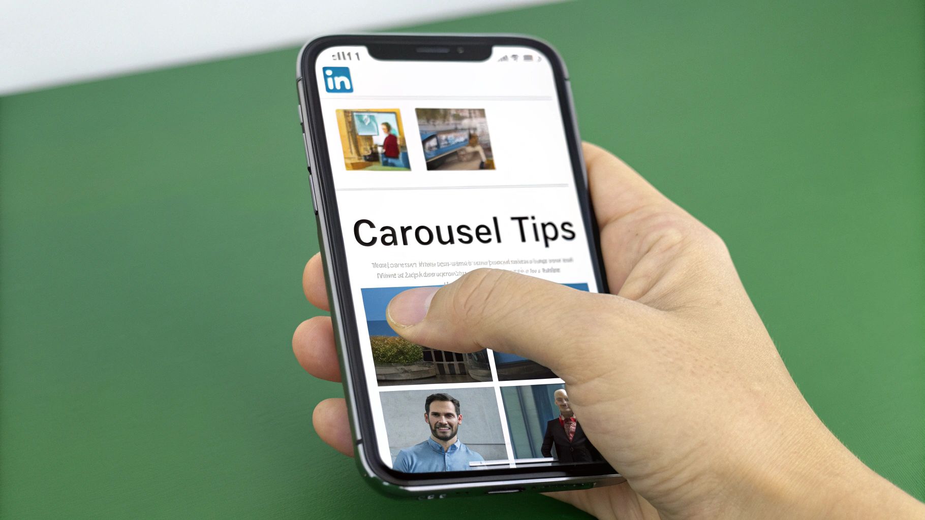
Here’s the secret to a great carousel: use the exact same dimensions and aspect ratio for every slide. Don't mix and match. If you do, LinkedIn will slap on awkward white space to force them into a uniform size, which instantly breaks the flow and just looks unprofessional.
For the best results, especially on mobile where most of your audience lives, two specific sizes are your go-to options.
Ideal Carousel Dimensions
The best carousels stick to either a square or a vertical format. Both of these are designed to command serious real estate on a screen, making your post much harder to just scroll past in a busy feed.
- Square (1:1 Aspect Ratio): The sweet spot here is 1080 x 1080 pixels. This format is clean, balanced, and just works reliably across both desktop and mobile. It's a classic for a reason.
- Vertical (4:5 Aspect Ratio): For this one, you'll want to use 1080 x 1350 pixels. This portrait orientation is a mobile powerhouse, maximizing screen space and creating a much more immersive experience for the viewer.
So, which one should you choose? It really depends on your content. Vertical is fantastic for things like infographics or detailed visuals where you need that extra height. Square, on the other hand, provides a classic, consistent frame that works for just about anything.
Best Practices for Engaging Carousels
Getting the dimensions right is step one, but a truly successful carousel tells a cohesive story. Your first slide is everything—it’s your hook. It has to be compelling enough to make someone want to see what’s on the next slide.
A killer cover slide gets straight to the point. For example, a title like "5 Mistakes You're Making in Job Interviews" immediately tells the reader what they'll get by swiping. It’s an instant value proposition.
To keep the momentum going, use visual cues to encourage that swipe. Things like arrows, dotted lines that stretch from one slide to the next, or a simple slide counter (e.g., "3 of 7") all act as prompts, guiding users to keep going.
And don't forget the finish line. End with a strong call-to-action on your final slide. Tell your audience exactly what to do next—whether that's to leave a comment, check out your website, or follow your page. This simple step turns a passive post into an active, engaging journey.
Let's face it, your LinkedIn profile is your digital handshake. A blurry or awkwardly cropped image can kill your credibility before anyone even reads your bio. Getting your profile and company page images right isn't just about looking good—it’s about making a sharp, professional first impression.
These visuals aren't just fluff; they're strategic assets. A crisp profile picture screams competence, while a well-designed banner is prime real estate to show off your brand or value proposition. They work together to build a presence that people trust on sight.
Personal Profile Image Dimensions
This is where you connect with peers, recruiters, and potential clients. The images here are all about you as an individual, making them critical for personal branding. Keeping them sharp helps you stand out in a sea of notifications and connection requests.
- Profile Picture: The magic number is 400 x 400 pixels. This is your face across the platform—in search results, comments, and messages. Don't skimp on quality here.
- Background Banner: Go for 1584 x 396 pixels. This wide, panoramic space is your personal billboard. Use it to showcase your industry, a key achievement, or a tagline that captures your professional brand.
Heads-up: When you design that banner, remember your profile picture will block the bottom-left corner on desktop. Keep any important text or logos out of that zone. It's always a good idea to check how it looks on both your computer and phone to make sure nothing crucial gets cut off.
Company Page Image Requirements
For any business, a LinkedIn Company Page is the hub for brand storytelling, recruiting, and generating leads. A pixel-perfect logo and cover image are non-negotiable for maintaining brand integrity. A fuzzy or misaligned logo just looks sloppy and can damage your credibility instantly.
Here are the exact specs you need for a polished company page:
- Company Logo: The standard here is 300 x 300 pixels. This square logo is your brand's consistent marker, appearing next to every post and update your company shares.
- Cover Image: Aim for 1128 x 191 pixels. This is your page’s main visual canvas. It's the perfect spot to reflect your company culture, a current marketing campaign, or your core mission.
By sticking to these specific sizes for profiles and pages, you’re ensuring every visual touchpoint is dialed in. That attention to detail reinforces your professionalism and helps build a strong, memorable identity on the world’s biggest professional network.
Essential Technical Tips for Image Quality
Getting the right dimensions for your LinkedIn images is only half the battle. If you want your visuals to look sharp and load fast, you have to nail the technical details, and you don't need expensive software to do it.
Beyond just the size, the file format you choose has a massive impact on image quality. It's worth spending a moment understanding the nuances of JPG vs PNG to make sure you're picking the right one for the job.
In short, it comes down to what's in your image. Use JPG for photographs and any other complex visuals with lots of colors and gradients. Its compression is brilliant at keeping file sizes small without a noticeable dip in quality for this kind of image.
But for anything with text, logos, or simple graphics with clean lines, PNG is the way to go. It uses lossless compression, which means it keeps every single detail perfect. This prevents those fuzzy artifacts or "halos" you sometimes see around text in a compressed JPG.
Export Settings and File Size Limits
Whether you're working in a pro tool like Adobe Photoshop or a free and accessible option like Canva, your export settings are what make or break the final result. For the best and most consistent results, always export your images using the sRGB color profile. This ensures your colors look the same across different web browsers and devices.
LinkedIn also has a file size limit of 5 MB for standard posts. Keeping your files under this cap prevents annoying upload errors and makes sure they load quickly for your audience, which is a big deal on mobile.
Here are a few quick tips for the most common tools:
- In Canva: When you hit download, just choose "PNG" for graphics and text, and "JPG" for photos. Canva's free version gives you all the control you need for this.
- In Adobe Photoshop: Your best friend here is the "Save for Web (Legacy)" option. It gives you precise control over everything—format (JPG, PNG-8, PNG-24), quality settings, and the final file size—before you ever hit save.
Paying attention to these small technical details is a simple step, but it makes a huge difference in how professional your content looks. For more tips on creating content that really performs, you can find more guides over on the Contentide blog.
Frequently Asked Questions
Even when you've got the basics down, a few common questions always pop up about LinkedIn's image specs. You might run into a weird issue with file formats, hit an unexpected size limit, or wonder why your image looks different on a phone versus a desktop.
Let's clear up those lingering uncertainties right now. Getting these small details right is what separates a professional-looking post from one that feels just a little bit off.
What Is the Maximum File Size for a LinkedIn Post?
For a standard image post, LinkedIn caps your file size at 5 MB. This isn't an arbitrary number; it’s designed to keep the feed loading quickly, especially for the huge number of people scrolling on their phones. If your beautiful graphic is over that limit, you'll need to compress it before uploading.
The limits change for other types of media, of course:
- Documents (like PDFs): You get a lot more room here, with a max size of 100 MB and a cap of 300 pages.
- Videos: For video uploads, LinkedIn gives you a generous 200 MB limit.
Pro tip: Always aim to keep your images well under the 5 MB limit. It’s a simple move that prevents those annoying, last-minute upload errors and gives everyone a better, faster experience. The algorithm notices things like load times, too.
What Is the Best Format for LinkedIn Images?
There's no single "best" format—it really depends on what your image actually is. But for 99% of cases, the choice is between two clear winners, and picking the right one is crucial for quality.
- Use JPG for Photos: If your image is a photograph with lots of colors, gradients, and subtle details, JPG is your best friend. It does a fantastic job of compressing the file size down without making the image look pixelated or blotchy.
- Use PNG for Graphics and Text: For any visual that includes logos, sharp lines, flat colors, or text overlays, always choose PNG. Its "lossless" compression is a game-changer here, preventing the blurry edges and weird artifacts that JPGs often create around text.
Choosing the right format is just as important as getting the dimensions right. It ensures your visuals are sharp, clear, and load fast—a perfect combo for performance.
Ready to stop worrying about image sizes and start creating high-impact content? Contentide is an AI-powered content generator designed to be both effective and affordable, helping you create authentic, engaging LinkedIn posts in minutes. Start creating better content today at Contentide.
Hope you found this helpful. Feel free to share your thoughts.